Though, 5 things.
1:
The logo is kinda wierd, but since it seems quite unique we will all get used to it.
How do you mean weird? The little star (*) will is already removed in the new logo btw.
2:
Is it supposed to be Special ATTack? Do lowercase ts look ugly or something?
Yes it doesn't look well at this point, i was busy with the name and the looks so its half done. The idea behind this is that there will be 5 stars or a crown above those letters, but still need to try how that looks. Plus i'm still not 100% comfortable with the used font, so theres a change the whole font will change.
3:
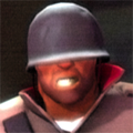
That picture of a soldier and medic should be either dynamic (changing every reload), change after you roll over each game or be an automatic slideshow of pictures from all games.
The idea of this is that the picture will change when you hover with your mouse over a game name that we support, plus i'm trying some things to also integrate our servers information for the games you hover over with your mouse. Just not sure how i'm going to implement this in the design yet.
4:
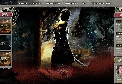
Just use the same style for the right bar and it will be exactly what I would personally expect.
At this point the right bar will have the same looks as the left bar, but i'm trying out some things. For example a full bar like the left, or more loose squares apart from each other. The thing is that the right bar will be used for different items and i'm thinking how i can give them all their own look.
5:
This is perfect. Don't mess around too much. After that make a forum theme and you will win... something.
Well i'am convinced about my own designing skills that ain't a problem

And yes ofcourse there needs to be forum theme, but that will come after the design is done for the webpage. Plus i need to get into phpBB to know whats possible here, i am only familiar with invision board.
this is getting awesome, great job again

two tips:
1)
next to the left menu, it's not spAcialattack.net
Yes, Spike said that yesterday and I've changed it already.
2)
imho it looks better with the right drop under logo removed and the menu moved to left:
I have to disagree on that one

. But i also don't like the white space there under the logo so i'm busy with it to fill it up with uuhmm i don't know yet

Thanks for the feedback, all things being mentioned are taken in consideration.